Fitness App — Solo & Coach-Guided Training
End-to-end design, research through tested prototypes. One product for two opposite user types: people who train alone and people who want a coach.
- Domain
- Fitness
- My Role
- Product Designer (end-to-end)
- Scope
- Research, UI/UX, Usability Testing
- Status
- Concept
Context
A mobile fitness app for people who want structured workouts but struggle with motivation and finding the right guidance. Some prefer following video programs independently; others want a personal coach. I designed a product that serves both, from research through tested high-fidelity prototypes. The project was unfunded, and it stopped when part of the team moved on to paid work. I took the design through research, testing, and handoff-ready prototypes before that.
What I did
- 01Validated the problem with competitor analysis, a survey, and 4 in-depth interviews
- 02Designed one product for two opposite user types: solo trainers and coach-guided users
- 03Moved coach matching out of settings into primary navigation after research
- 04Built the full high-fidelity flow from home and workout library to program creation and scheduling
- 05Ran usability testing and fixed two issues before handoff
What wasn’t working
People want structure and they want a coach, but no app gives them both.
The idea for this project came from a small team exploring opportunities in the fitness app space. The initial hypothesis was that existing apps force users to choose: either follow pre-made video workouts alone, or find a personal trainer through a separate platform. No product combined both experiences seamlessly.
The team wanted to validate this gap before investing in development. My role was to lead the full design cycle, from researching whether the problem was real, through designing and testing the solution.
Key questions we needed to answer
Competitor analysis
I analyzed both self-paced workout apps and coach-finding platforms, reviewing their functionality and user reviews from app stores. Key takeaways:
- Most apps excel at either solo workouts OR coach matching, rarely both
- Top user complaints: repetitive content, poor personalization, and difficulty finding the right trainer
- Successful apps emphasize video quality and filtering options
Survey
To understand general exercise habits and pain points, I ran a survey focused on how and where people exercise, what challenges they face, and their experience with fitness apps.
In-depth interviews (4 participants)
Based on survey patterns, I formed hypotheses and tested them through interviews with people who regularly exercise both at home and in the gym.
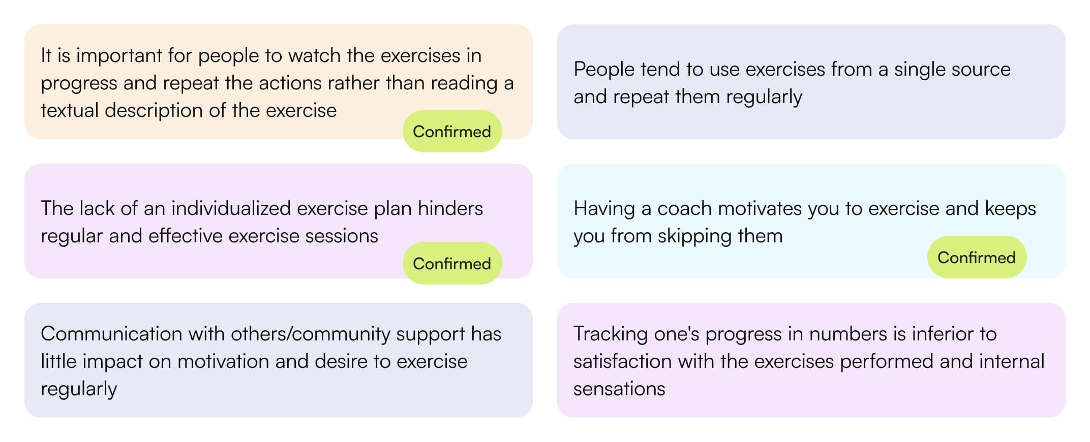
“I don’t like the boring and monotonous workouts that are often in apps. They are often not in the form of videos, so it’s not interesting and I’m looking for something else.”
“It’s important for me to like the coach personally, to match our personalities. You can’t understand it at once, so you just have to try.”
Two user types
One product had to work for people who train alone and people who want to be guided.
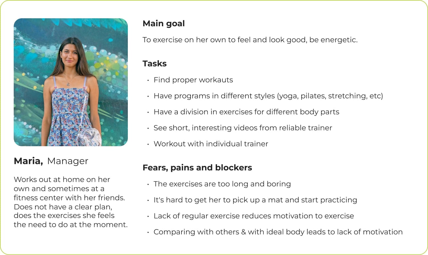
Research pointed to two distinct users. One trains alone and wants variety, structure, and no boredom. The other wants a coach, and cares more about personality fit than credentials. The product needed to serve both without making either feel like an afterthought.
I mapped two primary flows: finding and choosing a coach, built around trying before committing, and creating or selecting a program, built around scheduling.
Why one app instead of two
Considered
Pick one user type
Build for solo trainers only, the larger group in the survey. Simpler product, clearer positioning, but it ignores the finding that motivation is the reason people quit.
Chose
Both, with coach discovery in primary navigation
More surface area to design, but the two needs are the same need at different points in time. People start alone, lose motivation, then look for a coach. The app should be there for that switch instead of making them leave for another platform.
Building the app
Four sections, one visual direction, built out to high fidelity.
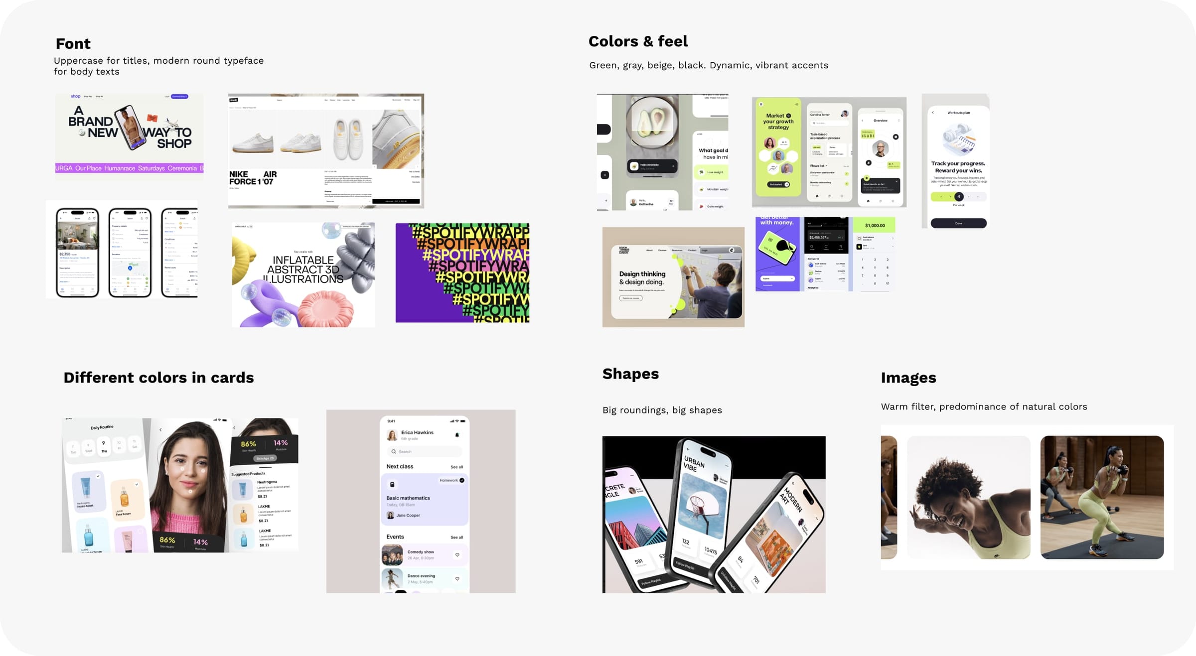
Visual style
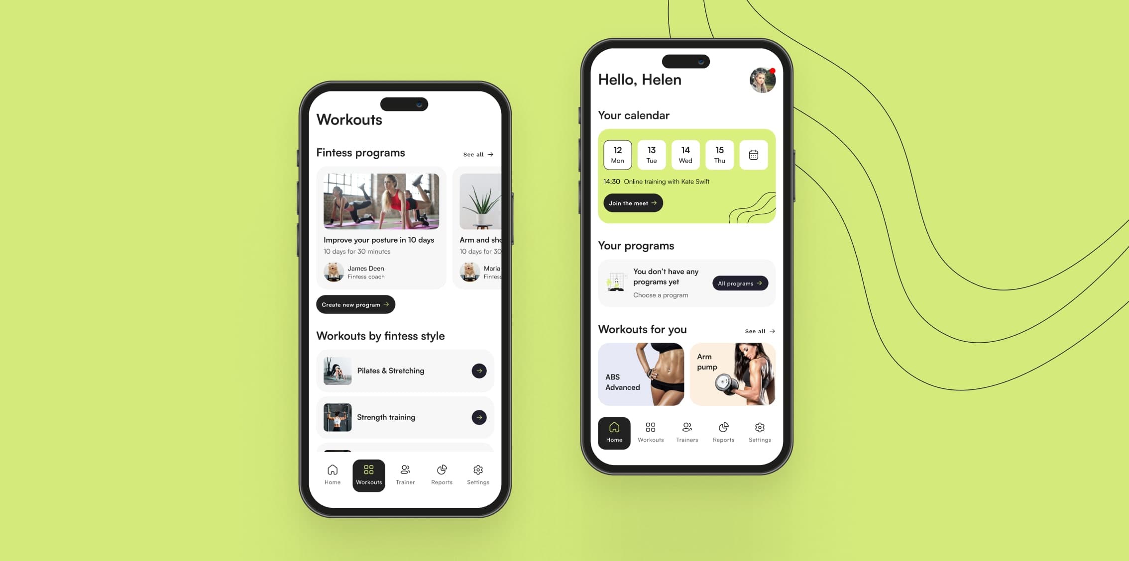
I explored two visual directions and presented both to the team. The selected direction emphasizes energy and dynamism through bold typography, dark backgrounds, and vibrant accent colors.
Main app flow
Home screen with personalized workout recommendations, program library, and quick-start options.
Adding to calendar
Program creation
Users can build custom workout plans: selecting exercises, setting duration, and scheduling across the week.
What testing changed
Two problems users hit that I didn’t predict.
Usability testing with target users validated the core flows and uncovered two specific issues that were fixed:
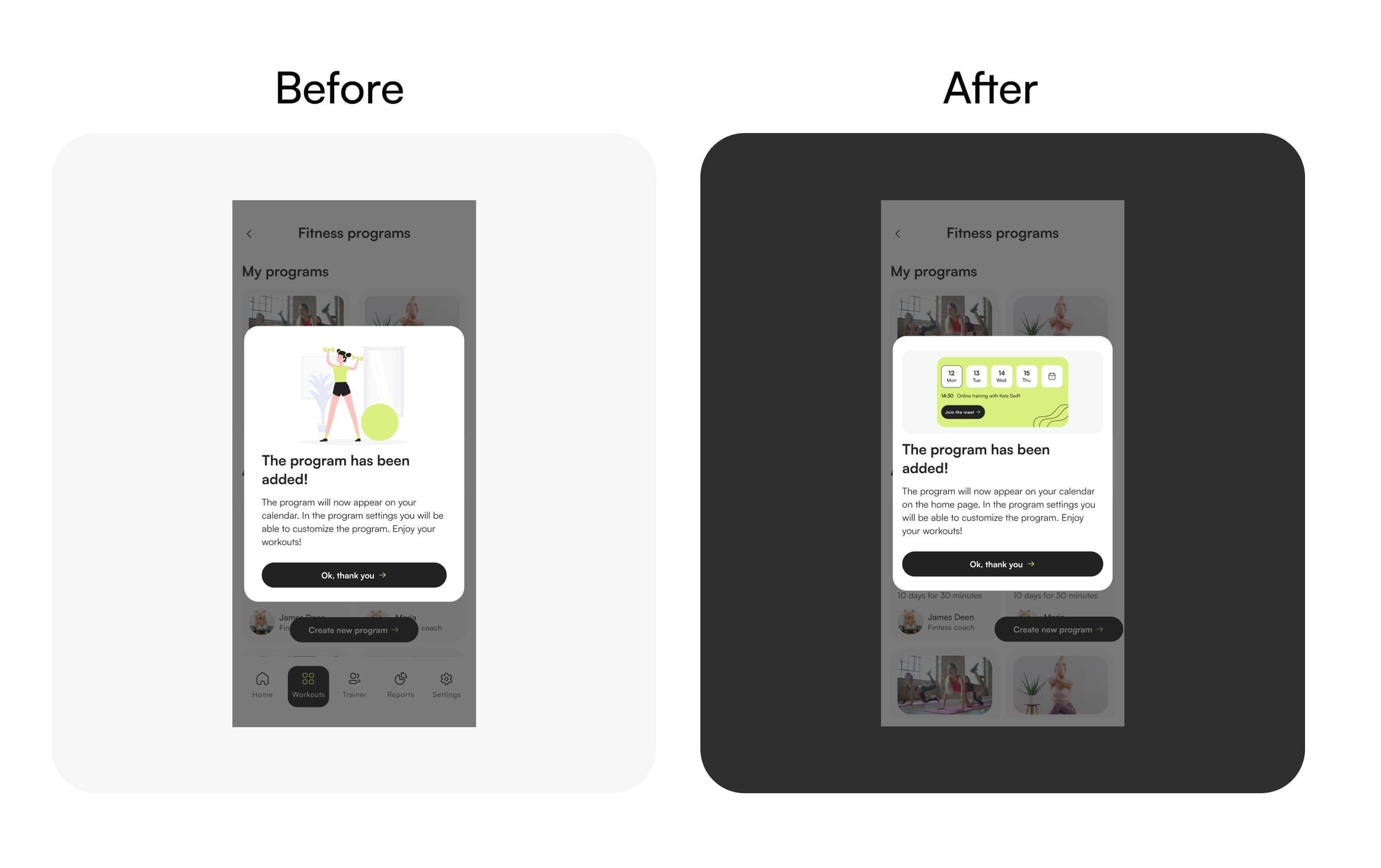
Issue 1: Users couldn’t find their saved program
Users added a program successfully but didn’t know where it went. The confirmation modal buried this information in body text.
Modal with decorative illustration and text that mentioned the location but didn’t emphasize it.
Replaced illustration with a calendar graphic showing the program being added. Shortened text to clearly state where to find it.
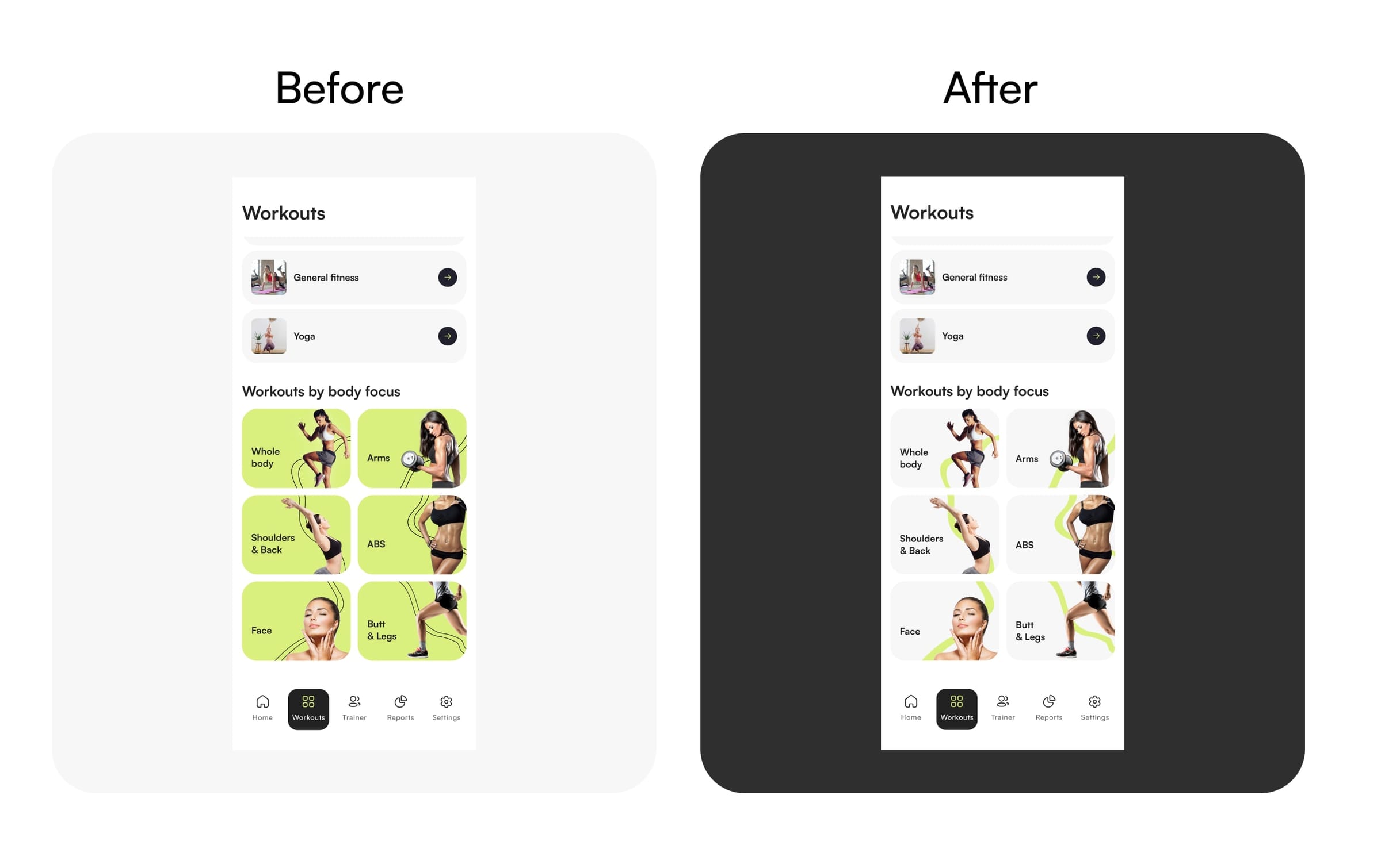
Issue 2: Bright category cards broke visual hierarchy
All testers noted the green workout category cards dominated the screen, pulling attention away from equally important sections.
Vibrant green cards for body-part categories competing with other content.
Neutral gray cards with green accents. Section now sits comfortably within the visual hierarchy.
Backlog created for next iteration
Testing also generated a prioritized list of improvements including clearer program vs. workout distinction, flexible reminder scheduling, and customizable exercise duration.
Results
- Validated the problem with competitor analysis, a survey, and 4 interviews before designing
- Research changed the structure: coach matching moved from settings to primary navigation
- Complete high-fidelity design, from home through program creation and scheduling
- Two usability issues found and fixed before handoff, with the rest written up as a prioritized backlog
What I’d do differently
I ran a broad survey before I knew what I was testing for. The interviews were more useful and I’d start there next time, then use a survey to check whether the patterns held at scale.
The coach side is the weaker half of the design. I built discovery and matching, but not the part that happens after: messaging, program adjustment, progress check-ins. That’s where the product would actually earn a subscription, and it’s the first thing I’d design if it picked up again.
Other Works
Foodtech · Marketplace · B2C · Mobile + PWA
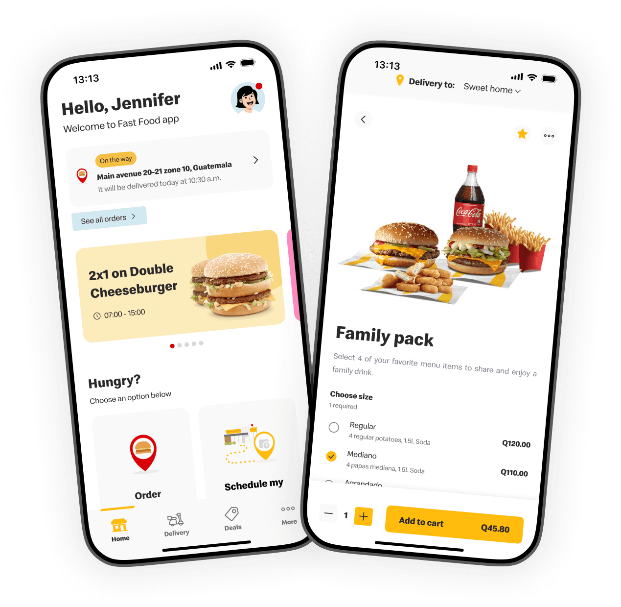
Global Fast-Food App Redesign
UX/UI overhaul of a delivery app and PWA serving 2M+ users across Central America.
Healthcare · Matchmaking · B2B + B2C · Web + Mobile
Mental Health Marketplace
Coordinators spent up to 24 hours matching each patient to a therapist. I redesigned matching and booking so it takes under 2 minutes, and no-shows dropped by about half.